For instance, I believe in headlines. Whether you’re designing an ad or a newspaper page, you need headlines to attract easily distracted readers. If you have a big idea and/or an arresting visual (say, the World Trade Center collapsing), maybe you can get away without a headline. But if your main image is like the one at left, better get a good headline. You need all the help you can get.
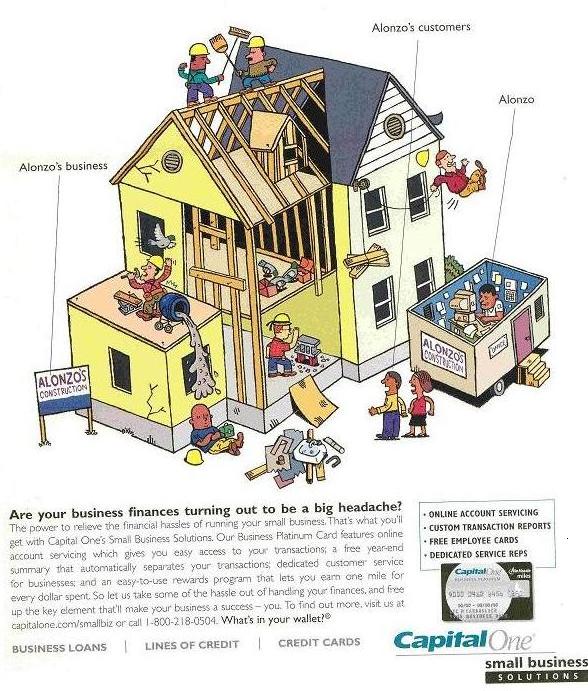
The ad at left appeared in the March issue of Fast Company. Capital One is targeting small business owners looking to tame their company finances. So where is the dramatic, benefit-oriented headline? It was deemed expendable, probably because the art director was so tickled with the cartoon.
Here’s the 411. Entrepreneurs want solutions. They don't want cartoons. They don't like cartoons. In my experience (and I once published a Dagwood/Mr. Dithers cartoon on the cover of PROFIT Magazine, but only once), business owners view cartons as kids’ stuff, not serious business. Plus, this is a complex cartoon with no central focus and no caption. Only readers with lots of time on their hands are going to sit down and try to figure out what it all means. When’s the last time you heard a busy entrepreneur say, “I’ve got nothing to do. Think I’ll spend an hour analyzing illustrations in this magazine.”
Worse, anyone who does study this cartoon finds the company being depicted is totally inept, its workers unprofessional at best, and likely suicidal. Few entrepreneurs find anything funny about unprofessional behavior. So if Capital One is expecting its prospects to identify with poor Alonzo, I think they're going to be disappointed.
Below the picture is the “sell” copy. It seems to have nothing to do with the cartoon. “Are your business finances turning out to be a big headache?” Alonzo’s problem is that his workers are building a substandard house and killing each other.
I could see this cartoon possibly working for an ad for a skills-training company, but it has no place in a serious financial ad.
The rest of the copy, about online account servicing, free year-end summaries and a rewards program, is good enough, I guess, but flat and uninteresting. It probably doesn't matter, since any entrepreneurs who stuck around to read the copy are going to find their heads hurting from trying to match the pitch with the cartoon, so they’re unlikely to last till the end.
The call to action? Buried at the tail end of a dense paragraph of low-contrast, hard-to-read body copy. No bold type for the URL, not even a “www” to help it stand out as a Web-based resource. Just a mess.
And don't get me started on the branded “Small Business Solutions” tagline. People with big dreams rarely like to be associated with such a demeaning word. (See my Jan. 10 post, Don’t call them “Small Business”.)
Takeaways: If you’re creating ads aimed at business owners, have a clear message. Help entrepreneurs solve their problems. Use headlines to attract attention. Keep your message simple. Don't monkey around with inappropriate humour (your audience takes itself very seriously). Use simple text devices (boldface, anyone?) to make your key messages stand out.
Note how Capital One put its own tagline [What’s in your wallet?] in bold instead of its key pitch, or its URL or phone number. Selling is about the customer’s needs, not yours.
No comments:
Post a Comment